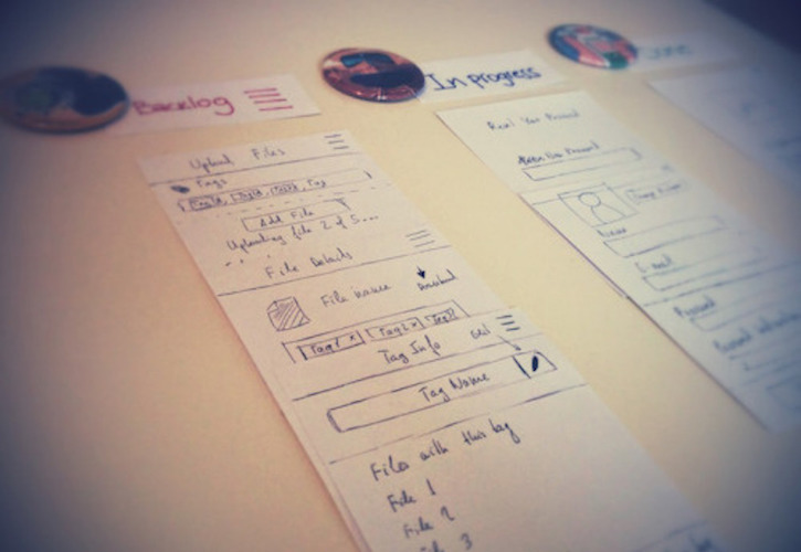
Two weeks ago our small team started to collaborate through our handmade kanban, which works well so far, and it has helped us to have a clear focus, efficient output and great cycle time. One of the most complex cards for this week included creating some nice progress bars, so I decided to share how I built them with HTML5.
Feel free to try it yourself and include them in your next project! It could enhance the user experience while waiting for a complete task!
1- HTML5 progress element
The first step in the HTML document is to add the HTML5 progress element <progress>. You should specify the max attribute, which is the maximum value when a task is finished, and the value, which is the current status of the progress bar. Find out more details about this element in css-tricks.
<div class="wrapper-bar">
   <progress class="progress-bar" value="60" max="100"></progress>
   <p class="progress-value">60%</p>
</div>
2- CSS styles
To change the appearance of the progress bar, let’s add some CSS styles. You can include display, width, height, border and border-radius properties. In this example I set -webkit-appereance to none, in order to reset the default styles (see .wrapper-bar progress).
To style the progress bar container, it’s necessary to set -webkit-progress-bar pseudoclass. In this case, I set the background, padding and `border-radius properties.
.wrapper-bar {
  margin-top: 50px;
  text-align: right;
  font-family: "Helvetica", sans-serif;
  font-size: 12px;
  color: #aaa;
  padding: 10px;
}

.wrapper-bar p {
  padding: 10px 0;
}

.wrapper-bar progress {
  display: block;
  width: 100%;
  height: 20px;
  border: none;
  border-radius: 100px;
  -webkit-appearance: none;
}

/* Style the background */
.wrapper-bar progress::-moz-progress-bar {
  background-color: #333;
  padding: 3px;
  border-radius: 100px;
}

.wrapper-bar progress::-webkit-progress-bar {
  background-color: #333;
  padding: 3px;
  border-radius: 100px;
}
3- Add some animation to the progress value
Now, let’s add some effect to the value inside the progress bar. So, we’ll need the -webkit-progress-value pseudoclass. You’ll notice that I set a linear gradient effect and an animation too.
.wrapper-bar progress::-webkit-progress-value {
  border-radius: 50px;

  /* Set background color of the gradient */
  background-color: #36D7B7;

  /* Set size of the square */
  background-size: 15px 15px;

  /*0% - 25% - start with some transparence rgba(255,255,255,.2),
    25% - 50% - transparent, which is the background color set,
    50% - 75% - rgba(255,255,255,.2),
    75% - 100% - transparent, which is the background color set.*/

background-image: linear-gradient(45deg, rgba(255, 255, 255, .2) 25%, transparent 25%, transparent 50%, rgba(255, 255, 255, .2) 50%, rgba(255, 255, 255, .2) 75%, transparent 75%, transparent 100%);
background-image: -webkit-linear-gradient(45deg, rgba(255, 255, 255, .2) 25%, transparent 25%, transparent 50%, rgba(255, 255, 255, .2) 50%, rgba(255, 255, 255, .2) 75%, transparent 75%, transparent 100%);
background-image: -moz-linear-gradient(45deg, rgba(255, 255, 255, .2) 25%, transparent 25%, transparent 50%, rgba(255, 255, 255, .2) 50%, rgba(255, 255, 255, .2) 75%, transparent 75%, transparent 100%);
background-image: -o-linear-gradient(45deg, rgba(255, 255, 255, .2) 25%, transparent 25%, transparent 50%, rgba(255, 255, 255, .2) 50%, rgba(255, 255, 255, .2) 75%, transparent 75%, transparent 100%);

/* Apply animation */
-webkit-animation: animation 4s linear infinite;
   -moz-animation: animation 4s linear infinite;
    -ms-animation: animation 4s linear infinite;
     -o-animation: animation 4s linear infinite;
        animation: animation 4s linear infinite;
}
4- Keyframe animation
Finally, add the keyframe animation using vendor prefixes. I named it “animation”, 0% and 100%, indicate the starting and ending states of the animation. Learn more about the keyframe animation syntax in css-tricks.
/* Keyframe animation */

@-webkit-keyframes animation {
  0% { background-position: 0px 0px; }
  100% { background-position: 200px 0px; }
}
@-moz-keyframes animation {
  0% { background-position: 0px 0px;  }
  100% { background-position: 200px 0px;  }
}
@-ms-keyframes animation {
  0% { background-position: 0px 0px;  }
  100% { background-position: 200px 0px;  }
}
@-o-keyframes animation {
  0% { background-position: 0px 0px;  }
  100% { background-position: 200px 0px;  }
}

@keyframes animation {
  0% { background-position: 0px 0px;  }
  100% { background-position: 200px 0px;  }
}
I’m really enjoying the learning process that this kanban flow facilitates!
View this live example.


