Image by Unsplash
In terms of images, sometimes building a web application may turn out to be a difficult process, since there are a wide rage of methods to do it. After trying diverse techniques, this post explains how to deliver efficiently responsive images by making use of the <picture> element, <source> element, media and srcset attributes.
Our aim is to provide multiple images for different device resolutions on demand. In some cases, we’ll need not only to make various image sizes available, but to serve images with great detail, which we’ll refer as art direction.
As mentioned before, users will access our app using multiple devices. We’ll need to test how images are displayed in various screen sizes and resolutions. One of the ways to test responsive design is through Chrome DevTools. Let’s use an emulated Google Nexus 5 phone to introduce some concepts we’ll need later:
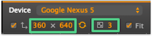
- Device dimensions: CSS pixel dimensions of the device. Really useful for web developers, since CSS and Media Queries will respond to these.
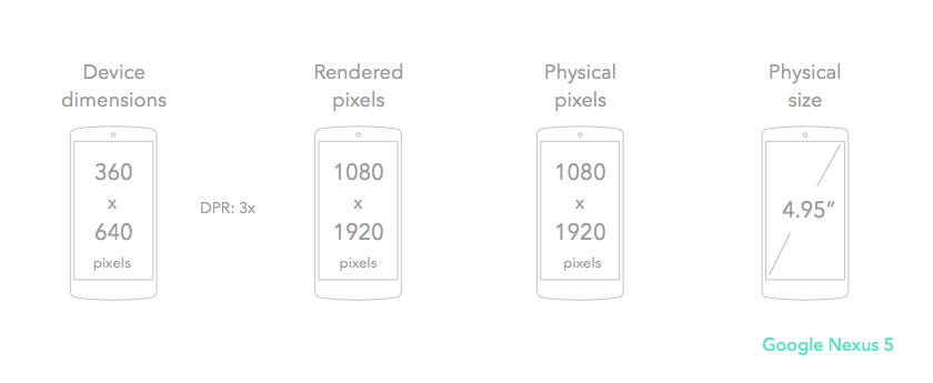
- DPR: device pixel ratio or CSS pixel ratio, which is the ratio between physical pixels and CSS pixels. It determines how a device resolution is interpreted by the CSS. For instance, Google Nexus 5 will render at 3x.
- Rendered pixels: device dimensions are multiplied by DPR to render elements. The interpreted resolution for Google Nexus 5 is (360x3) x (640x3) = 1080x1920.
- Physical pixels: actual pixels of the hardware.
- Physical size: length of its diagonal in inches.
Icon by Martin Jordan from the Noun Project
Let’s break down the steps to render the best images based on device characteristics:
1- Configure viewport
<meta name="viewport" content="width=device-width, minimum-scale=1.0, initial-scale=1.0, user-scalable=yes">Set the meta viewport tag on the <head> section of the HTML document. This will ensure browsers render your app and scale the content properly in a variety of devices. With width=device-width, content will match all screen sizes. minimum-scale=1.0 is the minimum amount the user can zoom. `initial-scale=1 is the initial zoom when page is loaded. user-scalable allows the user to zoom the page in and out.
2- HTML document and CSS
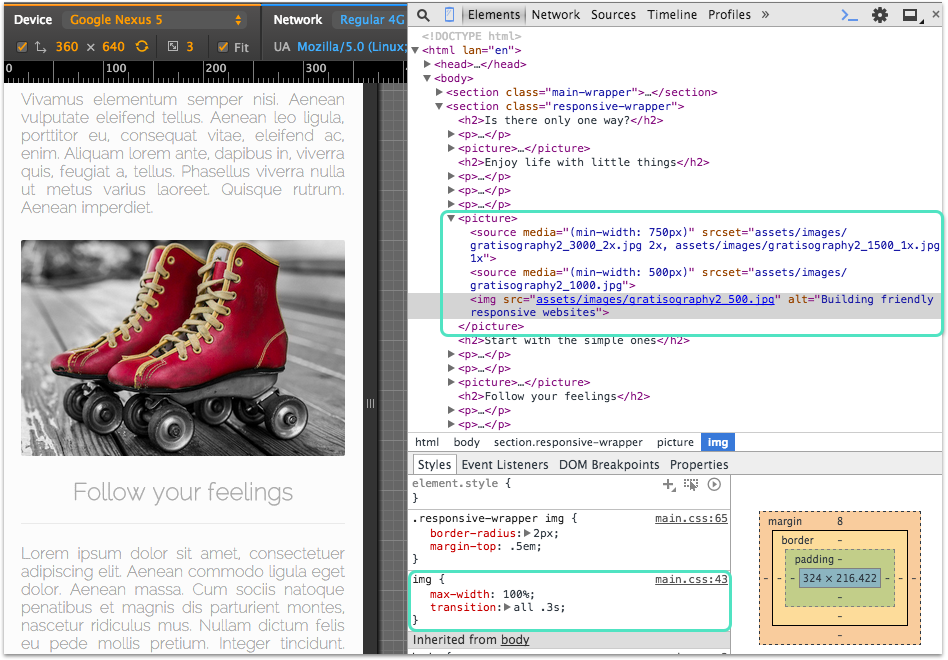
<picture id="banner-img">
  <source media="(min-width: 750px)" srcset="assets/images/gratisography1_3000_2x.jpg 2x, assets/images/gratisography1_1500_1x.jpg 1x">
  <source media="(min-width: 500px)" srcset="assets/images/gratisography1_1000.jpg">
  <img src="assets/images/gratisography1_500.jpg" alt="Building friendly responsive websites">
</picture>
On the body of your HTML document, include a <picture> element to serve multiple versions of an image. In this example I applied the art direction for some images, serving cropped versions to give proper detail in small / large screen sizes.
See how inside the <picture> element I added: <source> element with media and srcset attributes, as well as an <img> element. The <picture> element contains two sources that serve alternate versions of the image. We’ll use media queries to display these images at different viewports.
We set srcset attribute with “integer + x” after the image URL, which is the device pixel ratio or DPR. This means that the browser can decide which images to download based on its DPR, so for higher DPR the browser will use the image with higher resolution.
For viewports that are wider than 750px, for 1x device there is a 1x image available, which is 1500 pixels wide. And for 2x device there is an image with twice the pixel density (3000 pixels wide).
For viewports greater than 500px and less than 750px, the browser will load the image provided by srcset element (1000 pixels wide).
The <img> element acts as the fallback content, so if none of the sources are loaded, this <img> will be displayed by default. This will be also used in viewports that are narrower than 500px.
Finally, CSS tells the browser at what wide images must be displayed. So we insert max-width and width to 100vw to the <img> element, meaning that this image will be displayed at 100% of viewport size.
picture#banner-img img{
  max-width: 100vw;
  width: 100vw;
  box-shadow: 2px 2px 6px rgba(0, 0, 0, 0.3);
}
3- CSS for <img> element
For the rest of the images in the demo blog, the styles need to be applied to the <img> element. I included a max-width of 100% and a transition effect to all images.
img {
  max-width: 100%;
  transition: all .3s;
}
4- Time to test it with Chrome DevTools
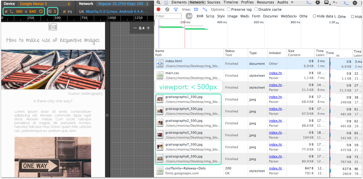
Now we need to test our code and make sure is working! Let’s use the Network tab from Chrome DevTools and test it with Google Nexus 5. Since its width is 360px, less than 500px, the browser will load the image contained in <img> element.
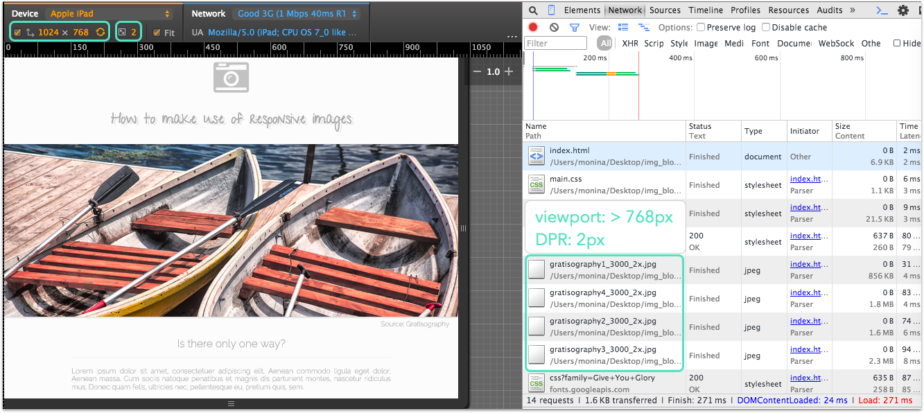
We can test this in any device. Finally, let’s check that our <source> element and its attributes are running, using an Apple iPad. It has a width of 1024px, so it will apply the media query for devices with more than 750px. Notice that the browser only downloads the 2x images that correspond to a 2x device, just what we were looking for!
Check out the code in github.