One of the most common sections you’ll find in a website is a Contact Form, and it was unavoidable that I had to tackle this in my current project. In this post I’d like to share with you an easy way to build a contact form from scratch.
Let’s start with your HTML document:
-
First, you can include Google Fonts to make more attractive your contact form (see how to do it in my previous post).
-
Add a <
form> element, which will wrap different elements and attributes of the contact form. Apply action (URL to which the information will be sent) and method (HTTP method to submit the data) attributes to the form element. -
Create a <
fieldset> element inside the <form> for a better organization. Fieldset is a block-level element that will wrap form elements. This <fieldset> includes a border outline by default, which we’ll modify within the CSS sheet. -
Add <
input> elements to get information from users, using the type attributes. Some of the input types for forms are: text, password, email, date, time, url, search, tel, number, range… -
Use <
textarea> element to collect user’s comments. -
Add <
input> element with the submit attribute (type=”submit”) to process user data. -
Provide a hint within the form with placeholder attribute, which will disappear once the user click on the input area.
-
If you want to ensure that users complete information, use a required attribute, which will also check if an email input is correct.
<!DOCTYPE html>
<html lan="en">
<head>
<link rel="stylesheet" type="text/css" href="assets/stylesheet/main.css">
<link href='http://fonts.googleapis.com/css?family=Lato:100,300,400|Pacifico' rel='stylesheet' type='text/css'>
</head>
<body>
  <h1>Simple Contact Form</h1>
  <!-- Contact Form -->
  <form action="#" method="post">
    <fieldset class="contact-form">
      <input type="text" name="name" placeholder="Name" required>
      <input type="email" name="email" placeholder="Email address" required>
      <input type="text" name="subject" placeholder="Subject" required>
      <textarea name="message" placeholder="Add your message here" required></textarea>
      <input type="submit" id="submit" value="Submit" >
    </fieldset>
  </form>
</body>
</html>
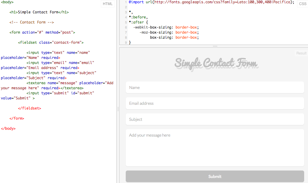
This is the result:

Now, let’s add some styles within out CSS stylesheet to polish our contact form:
- Add the box-sizing property, using border-box value to make sizing all of our elements much easier. It will maintain the element’s width no matter the padding or border values they have. Use the universal selector * to select all the elements and apply the box-sizing property.
*,
*:before,
*:after {
  -webkit-box-sizing: border-box;
     -moz-box-sizing: border-box;
box-sizing: border-box;- Custom styles for the body and headlines, including the typefaces chosen through Google Fonts:
body {
  color: #bfbfbf;
  font-family: 'Lato', 'Open Sans', 'Helvetica Neue', Helvetica, Arial, sans-serif;
  background: rgba(245,245,245,1);
}
h1 {
  font-family: 'Pacifico', 'Open Sans', 'Helvetica Neue', Helvetica, Arial, sans-serif;
  text-align: center;
  text-shadow: 2px 2px 0px rgba(255,255,255,.7), 5px 7px 0px rgba(0, 0, 0, 0.1);
}- Add attributes to the <
form>, center the elements within the form and include a maximum width. Then, eliminate the border by default from the <`fieldset> element:
form {
  max-width: 600px;
  text-align: center;
  margin: 0 auto;
}
fieldset {
  border: 0;
  margin: 0;
  padding: 0;
}- Configure .contact-form class for input and textarea elements. To get rid of the blue outline they have by default, set the outline property to 0 (cero). You also can enhance the user’s experience adding more space to the textarea element with the use of height property.
.contact-form input,
.contact-form textarea {
  border: 0;
  outline: 0;
  display: block;
  width: 100%;
  margin-top: 1em;
  padding: .8em;
  font-family: 'Lato', 'Open Sans', 'Helvetica Neue', Helvetica, Arial, sans-serif;
  font-weight: 300;
  font-size: 14px;
  border-radius: 6px;
  box-shadow: 0 1px 1px rgba(34,34,34,0.1);
  resize: none;
}
.contact-form textarea {
  margin-bottom: 1em;
  height: 125px;
}- Style the element that is currently activated by the mouse or targeted by the keyboard, adding
box-shadowproperty to the:focuspseudo-class.
.contact-form input:focus {
  box-shadow: 0 0px 2px rgba(3,201,169,1)!important;
}
.contact-form textarea:focus {
  box-shadow: 0 0px 2px rgba(3,201,169,1)!important;
}- Submit input is used to process the user data, we’ll add
:hoverpseudo-class to change the color when the mouser hovers over it:
#submit {
  color: white;
  background-color: #bfbfbf;
  cursor: pointer;
  font-weight: 400;
}
#submit:hover {
  background-color: rgba(3,201,169,.6);
}
That’s it! this is a simple contact form to add in your web page. Feel free to customize it with your favorite styles.
If you feel that you’d like to include some icons to make your contact form even more stunning, I’ll recommend to try with FontAwesome icons. First, you’ll find out some ways to get started with Font Awesome, I chose to download the library and reference the location to my font-awesome.min.css
- Include in the
headof your HTML document the reference to your font-awesome.min.css.
<link rel="stylesheet" href="assets/font-awesome/css/font-awesome.min.css">- Add <
div> elements to wrap the icons. Then, choose icons, click on them and copy the snippet provided into your HTML document.
I add also a .wrapper class to use it later in the CSS sheet. See examples about how to use Font Awesome icons here.
<form action="#" method="post">
  <fieldset class="contact-form">
    <div class="wrapper">
      <i class="fa fa-user"></i>
      <input type="text" name="name" placeholder="Name" required>
    </div>
    <div class="wrapper">
      <i class="fa fa-envelope"></i>
      <input type="email" name="email" placeholder="Email address" required>
    </div>
    <div class="wrapper">
      <i class="fa fa-quote-right"></i>
      <input type="text" name="subject" placeholder="Subject" required>
    </div>
    <div class="wrapper">
      <i class="fa fa-comments"></i>
      <textarea name="message" placeholder="Add your message here" required></textarea>
    </div>
    <input type="submit" id="submit" value="Submit" >
  </fieldset>
</form>- In your CSS configure the .wrapper class and icon’s properties, such as color or position.
.wrapper {
  position: relative;
}
.fa-user,
.fa-envelope,
.fa-quote-right,
.fa-comments {
  color: #bfbfbf;
  position: absolute;
  top: 12px;
  left: 15px;
}- Finally, change the
paddingproperty to add some space between icons and placeholder’s boxes.
.contact-form input,
.contact-form textarea {
  border: 0;
  outline: 0;
  display: block;
  width: 100%;
  margin-top: 1em;
  padding: .6em .06em .6em 2.8em;
  font-family: 'Lato', 'Open Sans', 'Helvetica Neue', Helvetica, Arial, sans-serif;
  font-weight: 300;
  font-size: 14px;
  border-radius: 6px;
  box-shadow: 0 1px 1px rgba(34,34,34,0.1);
  resize: none;
}
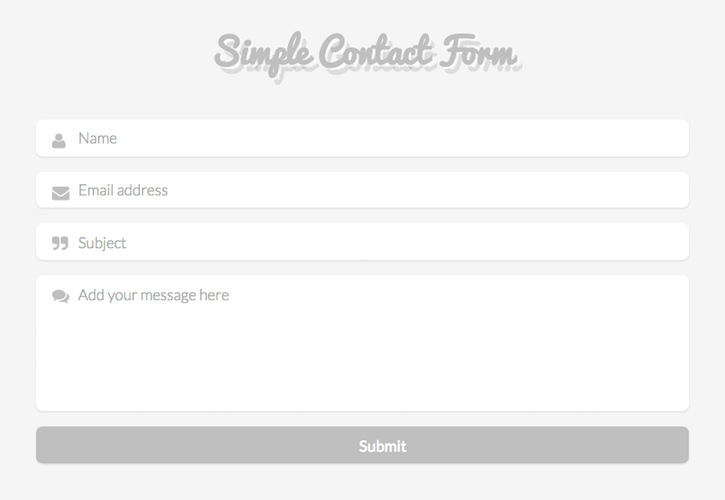
This was the result of this simple contact form using Font Awesome icons.

It is really worth it to start coding, and I feel really happy with what I’ve learnt so far. I’d love to hear your feedback and your experience.
